Catalogue Search | MBRL


Are you sure you want to remove the book from the shelf?

{{itemTitle}}
94
result(s) for
"Visualisatie."
Sort by:


Information visualization : perception for design
Most designers know that yellow text presented against a blue background reads clearly and easily, but how many can explain why, and what really are the best ways to help others and ourselves clearly see key patterns in a bunch of data? When we use software, access a website, or view business or scientific graphics, our understanding is greatly enhanced or impeded by the way the information is presented. This book explores the art and science of why we see objects the way we do. Based on the science of perception and vision, the author presents the key principles at work for a wide range of applications--resulting in visualization of improved clarity, utility, and persuasiveness. The book offers practical guidelines that can be applied by anyone: interaction designers, graphic designers of all kinds (including web designers), data miners, and financial analysts. Complete update of the recognized source in industry, research, and academic for applicable guidance on information visualizing. Includes the latest research and state of the art information on multimedia presentation. More than 160 explicit design guidelines based on vision science. A new final chapter that explains the process of visual thinking and how visualizations help us to think about problems. Packed with over 400 informative full color illustrations, which are key to understanding of the subject.
eBook

Storytelling with data
Don't simply show your data--tell a story with it!Storytelling with Data teaches you the fundamentals of data visualization and how to communicate effectively with data.You'll discover the power of storytelling and the way to make data a pivotal point in your story.
eBook

Possessors and Possessed
Possessors and Possessedanalyzes how and why museums-characteristically Western institutions-emerged in the late-nineteenth-century Ottoman Empire. Shaw argues that, rather than directly emulating post-Enlightenment museums of Western Europe, Ottoman elites produced categories of collection and modes of display appropriate to framing a new identity for the empire in the modern era. In contrast to late-nineteenth-century Euro-American museums, which utilized organizational schema based on positivist notions of progress to organize exhibits of fine arts, Ottoman museums featured military spoils and antiquities long before they turned to the \"Islamic\" collections with which they might have been more readily associated. The development of these various modes of collection reflected shifting moments in Ottoman identity production. Shaw shows how Ottoman museums were able to use collection and exhibition as devices with which to weave counter-colonial narratives of identity for the Ottoman Empire. Impressive for both the scope and the depth of its research,Possessors and Possessedlays the groundwork for future inquiries into the development of museums outside of the Euro-American milieu.
eBook

The craft of information visualization : readings and reflections
Since the beginning of the computer age, researchers from many disciplines have sought to facilitate people's use of computers and to provide ways for scientists to make sense of the immense quantities of data coming out of them. One gainful result of these efforts has been the field of information visualization, whose technology is increasingly applied in scientific research, digital libraries, data mining, financial data analysis, market studies, manufacturing production control, and data discovery.This book collects 38 of the key papers on information visualization from a leading and prominent research lab, the University of Maryland's Human-Computer Interaction Lab (HCIL). Celebrating HCIL's 20th anniversary, this book presents a coherent body of work from a respected community that has had many success stories with its research and commercial spin-offs. Each chapter contains an introduction specifically written for this volume by two leading HCI researchers, to describe the connections among those papers and reveal HCIL's individual approach to developing innovations. *Presents key ideas, novel interfaces, and major applications of information visualization tools, embedded in inspirational prototypes.*Techniques can be widely applied in scientific research, digital libraries, data mining, financial data analysis, business market studies, manufacturing production control, drug discovery, and genomic studies.*Provides an \"insider\" view to the scientific process and evolution of innovation, as told by the researchers themselves.*This work comes from the prominent and high profile University of Maryland's Human Computer Interaction Lab
eBook

Visualization Handbook
This Handbook provides an overview of the field of visualization by presenting the basic concepts, providing a snapshot of current visualization software systems, and examining research topics that are advancing the field. This text is intended for a broad audience, including not only the visualization expert seeking advanced methods to solve a particular problem, but also the novice looking for general background information on visualization topics. The largest collection of state-of-the-art visualization research yet gathered in a single volume, this book includes articles by a who’s who of international scientific visualization researchers covering every aspect of the discipline, including:Virtual environments for visualizationBasic visualization algorithmsLarge-scale data visualizationScalar data isosurface methodsVisualization software and frameworksScalar data volume renderingPerceptual issues in visualizationVarious application topics, including information visualization.This covers a wide range of topics, in 47 chapters, representing the state-of-the-art of scientific visualization.
eBook

Information visualization : perception for design
Information Visualization is the major revision of a classic work on information visualization.This book explores the art and science of why we see objects the way we do.Based on the science of perception and vision, the author presents the key principles at work for a wide range of applications - resulting in visualization of improved clarity.
eBook
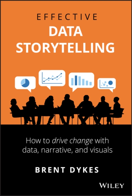
Effective Data Storytelling
The ability to effectively communicate with data is no longer a luxury in today's economy; it is a necessity. Transforming data into visual communication is only one part of the picture. It is equally important to engage your audience with a narrative-to tell a story with the numbers. This book will teach you the essential skills necessary to communicate your insights through persuasive and memorable data stories. Narratives are more powerful than raw statistics, more enduring than pretty charts. When done correctly, data stories can influence decisions and drive change. Most other books focus only on data visualization while neglecting the powerful narrative and psychological aspects of telling stories with data. Author shows you how to take the three central elements of data storytelling-data, narrative, and visuals-and combine them for maximum effectiveness.
eBook

Atlas of Knowledge
Maps of physical spaces locate us in the world and help us navigate unfamiliar routes. Maps of topical spaces help us visualize the extent and structure of our collective knowledge; they reveal bursts of activity, pathways of ideas, and borders that beg to be crossed. This book, from the author ofAtlas of Science, describes the power of topical maps, providing readers with principles for visualizing knowledge and offering as examples forty large-scale and more than 100 small-scale full-color maps. Today, data literacy is becoming as important as language literacy. Well-designed visualizations can rescue us from a sea of data, helping us to make sense of information, connect ideas, and make better decisions in real time. InAtlas of Knowledge, leading visualization expert Katy Börner makes the case for a systems science approach to science and technology studies and explains different types and levels of analysis. Drawing on fifteen years of teaching and tool development, she introduces a theoretical framework meant to guide readers through user and task analysis; data preparation, analysis, and visualization; visualization deployment; and the interpretation of science maps. To exemplify the framework, the Atlas features striking and enlightening new maps from the popular \"Places & Spaces: Mapping Science\" exhibit that range from \"Key Events in the Development of the Video Tape Recorder\" to \"Mobile Landscapes: Location Data from Cell Phones for Urban Analysis\" to \"Literary Empires: Mapping Temporal and Spatial Settings of Victorian Poetry\" to \"Seeing Standards: A Visualization of the Metadata Universe.\" She also discusses the possible effect of science maps on the practice of science.
eBook
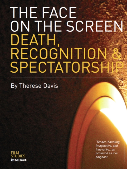
The face on the screen
This work aims to rethink the facial close-up in terms other than those associated with the humanist view of the face as 'mirror of the soul'. It proposes a dialectical reversal or about-face. It provides detailed studies of media spectacles of faces becoming unrecognizable.
eBook